Considering I haven't posted a thread in awhile, I figured what better way to return than to complain about something that doesn't matter!
If you know me you know how much I prefer physical media over digital. I love having book shelf filled with big bulky books to display. However, maybe it's just me but magic books seem to have THE WORST COVERS in the history of literature. I like to be able to admire and stare at my collection but this becomes difficult when the cover doesn't offer much. I understand art is subjective so this is only the opinion of one catfish obsessed magician. That being said the cover of magic books are poorly made especially when compared to other literature and should DRASTICALLY change.
Firstly, I would like to bring to the jury's attention to the cover of an all time classic
 This is a significant improvement. I love the nice blue background perfectly matched with amazing illustrations. Clearly an unaware book buyer would quickly realize what is the contents of this book. ...but I still think improvements could be made. Here is a quick pitch: Imagine a literal road where the lines in the middle are made of playing card suits along with street signs along the side of the road marked with these beautiful illustrations that read "The palm 82 miles up" (Or alternatively fanning "82 pages up") Then "riffle shuffling 28 miles up", and so on and so forth. Maybe you think that's stupid and I'm sure if you feel that way you are not the only one.
Now many of you may believe I am taking this too far. However if you look to other book covers you might be able to understand my frustration. Take for example the classic Bradbury piece:
To end us off I would like to present what I believe to be THE MOST DISAPPOINTING COVER in the history of life its self. One of the biggest topics of discussion among magicians is of course the mystery surrounding S.W Erndnase, and subsequently his book "EXPERT AT THE CARD TABLE". Every year new magicians will come into the art and be suggested this "Bible". So it only made sense to release a softcover and cheaper edition. That is when in 1995 Dover absolutely dropped the ball when they released this:
 So bland it'll dry your tongue without proper eye protection. Ugly background color. The average laymen running across this at a store or library will be beyond baffled at this. Given this shouldn't be that big of a surprise considering Dover is known to produce the same cover on different books

 However this behavior is just inexcusable. Taking a drawing from a random page, coloring it and slapping some text lower what should instead enhance the book. Maagicians spend unbelievably hours on their books, therefor the first thing the reader sees should reflect that. That is why it is our duty to not stand for this a push forward for new creative book covers that improve our book shelf and help us truly appreciate what we so easily forget. Thank you.
Now of course who am i to say? I'm not an artist in anyway shape or form. However i will put my money where my mouth is. In one day on MSN paint I designed this:
 Obviously it doesn't look good. Its a sup-par idea without an art style. So now, it is your turn to be the critic. What do you think. And if anyone out there does like it, after your done with your eye surgery feel free to buy the rights to EATCT and get a real expert card mechanic like Richard Turner, Jason England, or yourself to help write comments at the end of each chapter put this as the cover and release it as an E-book! Boom its a money printer just send me 75% royalties and we are done!
P.S. Here are some covers that just didn't make the final cut of the essay. Enjoy
 This has too much blank space and the center piece photograph is just not a great representation of the amazingness of what is within.
 One of my all time favorite books, but this cover gives off a bad impression. It looks, silly, kiddy, childish, but is really a BRILLIANT, and amazing book on the art. This book proves that you can't judge a book by it's cover because it might look like a kitty but it PACKS A PUNCH. Highly recommended.
 This very well might be my favorite book on magic. Great theory, and great tricks from a great man. But it's just a stereotypical L&L publishing template, but this book is so much more than "ANOTHER L&L book" it's really great and I wish it had a really great cover to help it stand out. It doesn't even have the illustrator's name on it!!!! (Which is Michael's wife BTW).
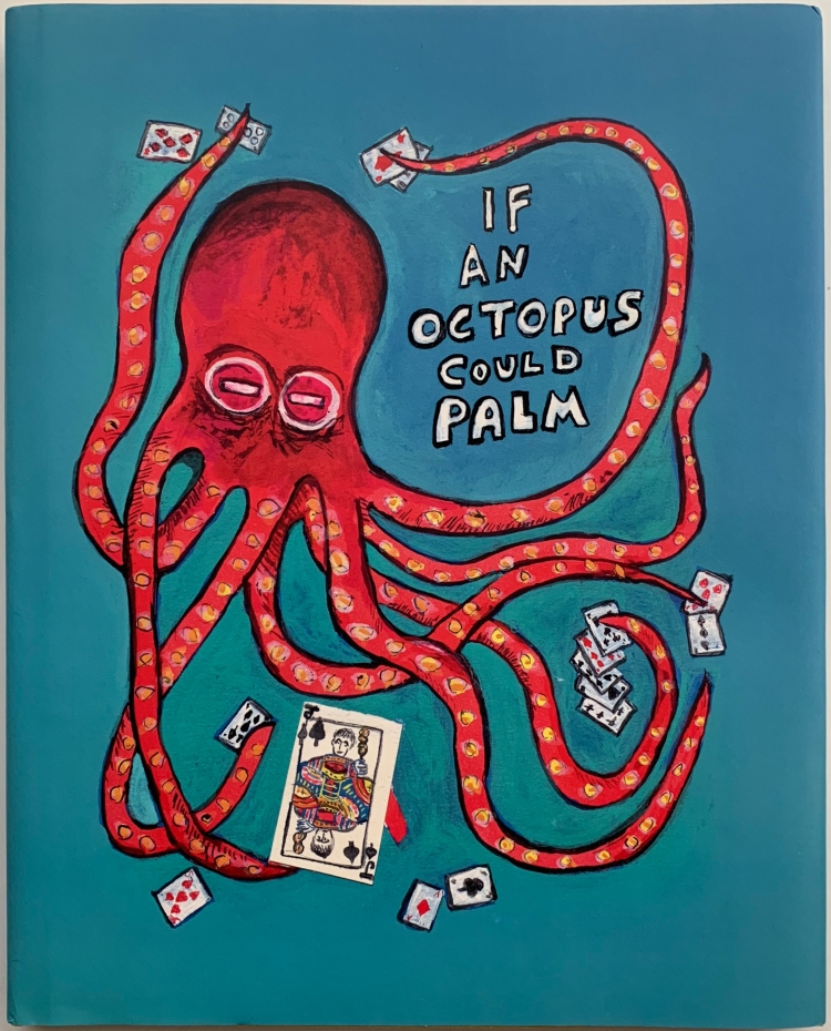
And of course not all are bad here are my favorites

Crazy and bold. Perfect summary of the book!
 OH MAN! This is just outstanding! Honestly one of my favorite book covers of all time, not just magic related
If you know me you know how much I prefer physical media over digital. I love having book shelf filled with big bulky books to display. However, maybe it's just me but magic books seem to have THE WORST COVERS in the history of literature. I like to be able to admire and stare at my collection but this becomes difficult when the cover doesn't offer much. I understand art is subjective so this is only the opinion of one catfish obsessed magician. That being said the cover of magic books are poorly made especially when compared to other literature and should DRASTICALLY change.
Firstly, I would like to bring to the jury's attention to the cover of an all time classic
ROYAL ROAD TO CARD MAGIC

Sure, it is bold colored and simplistic. Clearly a result of its time. The bland over-sized font and clear back round shows a library user what they are renting, but in my opinion in a very insufficient way. So when it was redone it looked like...
Now many of you may believe I am taking this too far. However if you look to other book covers you might be able to understand my frustration. Take for example the classic Bradbury piece:
FAHRENHEIT 451

This elegant cover is just as creative as it is beautiful. The usage of colors set a beautiful mood. The layout of text is simply unmatched (pun unintended) by any other cover. It gives the viewr a great sense of curiosity, while a prior reader will smile ear to ear and such a creative drawing. Truly one of the best due to its simplicity and astoundingly thoughtful creativity. Another example comes in the form of the satirical Anti-Communistic George Orwell novel:ANIMAL FARM

This cover matches both the tone and mood of the book perfectly. Just looking at this could both make you crack a smile and also feel a little menacing. This artist had an amazing ability to design a meaningful cover that fills the viewer with as many emotions and the book fills the reader. This makes it perfect on any and every shelf. All this being said, not a single list of great book covers could be complete without THE FAULT IN OUR STARS
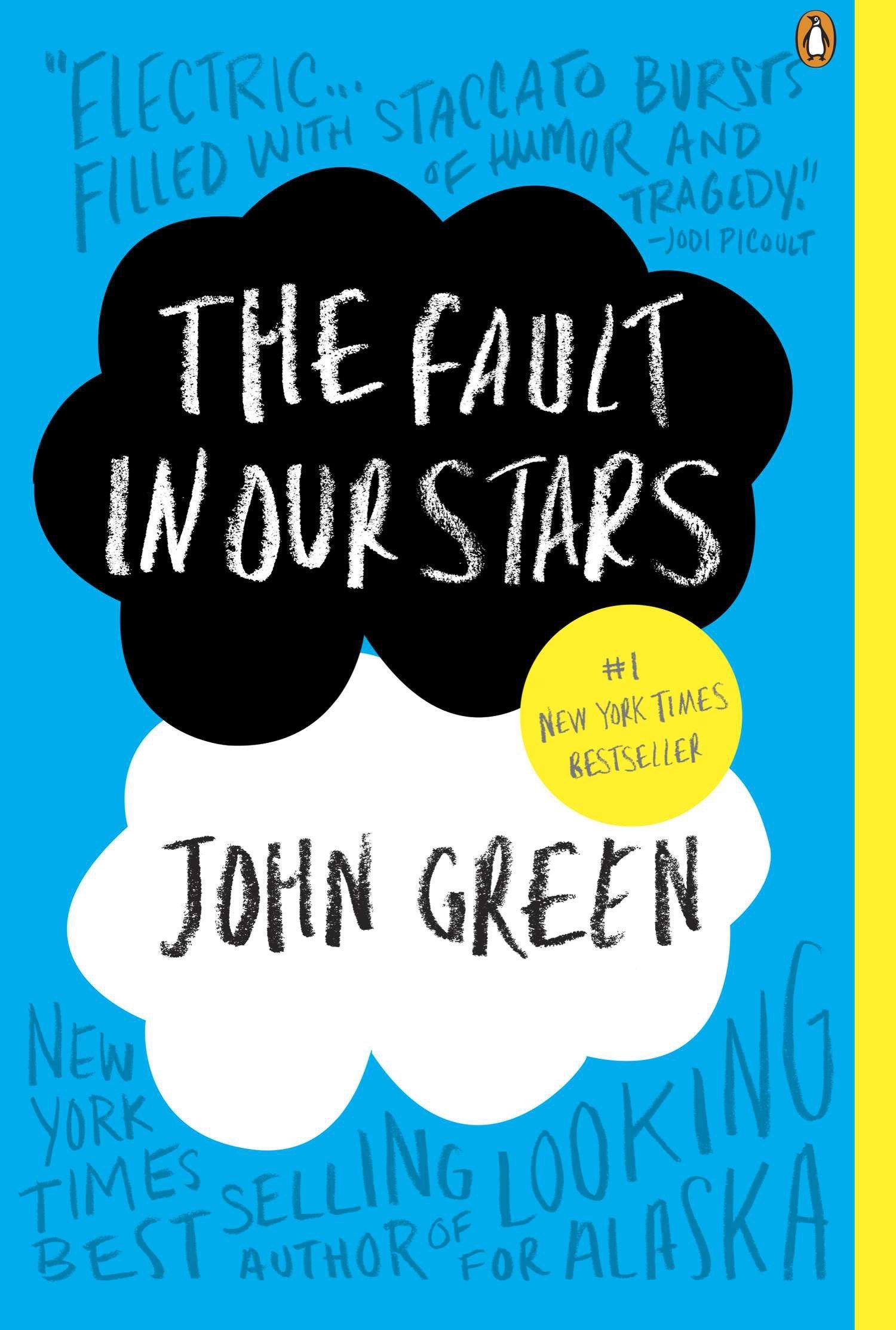
This is the definition of simplistically brilliant. just a quick glance is pleasing to the eyes due to the BEAUTIFUL color scheme and amazing font. There isn't even too much to say about this one. You look at the book confused at what it is and when you finish reading you'll realize that was the author's intention. So although many argue that a book's cover is simply a last second thought and a "useless add-on", it should be clear that a book's cover can greatly improve the overall product no matter the genre or age.
To end us off I would like to present what I believe to be THE MOST DISAPPOINTING COVER in the history of life its self. One of the biggest topics of discussion among magicians is of course the mystery surrounding S.W Erndnase, and subsequently his book "EXPERT AT THE CARD TABLE". Every year new magicians will come into the art and be suggested this "Bible". So it only made sense to release a softcover and cheaper edition. That is when in 1995 Dover absolutely dropped the ball when they released this:
Now of course who am i to say? I'm not an artist in anyway shape or form. However i will put my money where my mouth is. In one day on MSN paint I designed this:
P.S. Here are some covers that just didn't make the final cut of the essay. Enjoy
And of course not all are bad here are my favorites
Crazy and bold. Perfect summary of the book!
There we have it! A pretty big waste of time but I hope you enjoyed it! Oh and if your wondering why there were no DM covers... oh thats a thread for another day...


") ). But I think there are some beautiful book covers in magic, and especially Vanishing Inc. is great at designing them. Examples:
). But I think there are some beautiful book covers in magic, and especially Vanishing Inc. is great at designing them. Examples:


")